
Editor Article: What Makes A Good Book Cover?
 When we posted up the cover of Sarah Dunn’s novel Secrets To Happiness, we were asked by author Sarah Duncan just what it is like we like it a cover as, apparently - and shockingly, authors don’t have much say in their covers. It got me thinking and here’s my thoughts along with some comparisons!
Like most people a book cover is a huge thing for me. I know, I know: Don’t judge a book by it’s cover and all that but the thing is, if a cover is truly awful we’re hardly going to pick up the book regardless of what’s inside the pages, are we? Because the truth is a beautiful book cover looks far better on a shelf than an ugly one. It’s true that Jill Mansell’s earlier covers aren’t the greatest but the only reason I picked up The One You Really Want was because it was already on my mums shelf. I certainly wouldn’t have bought it. Her book covers have all had make-overs now and they look fantastic. The same goes for Christina Jones’s older books and Carole Matthews’s older books. All have rather horrible looking jackets but they were published in the 90′s so it can’t really be helped. Their newer books now look fab and, at least Carole’s, are being re-jacketed.
As the times have changed, most book covers are looking better than ever but there are still a few stinkers as I’ll compare below. I think the most surprising book cover not to have changed at all is Sophie Kinsella’s book covers. I am a HUGE fan of Sophie but I really don’t like her book covers, particularly the Shopaholic series. Her stand-alone covers aren’t too bad and I quite like the cover for Remember Me? but her Shopaholic books are in dire need of a modern re-design. The cover for Mini Shopaholic has been released and the truth is, I don’t really like it. It’s OK, and I’ll still buy it, but only because it’s got Sophie’s name on the front. I probably wouldn’t look twice if it wasn’t Sophie Kinsella’s new book. Sophie is one of the best writers out there and she deserves to have a funky, fresh, modern cover and I don’t understand why she hasn’t been given one.
Here are some cover comparisons as well as my thoughts on the covers. Let’s start with Sarah Dunn’s novel Secrets To Happiness:

 Now, if you’re honest with yourself, which cover would you pick up? The one to the left is the UK version out late 2010 and the one to the right is the USA version. I think the US version absolutely screams cute and I just adore it. The UK version on the other hand looks rather cack-handed. It can’t decide whether it wants to be cartoon-y or real so has decided, instead, to go half and half and this is the result. It looks entirely fake and I just can’t fathom why it looks the way it does. Is it just me?!

 When Adele Parks moved from Penguin to Headline I knew it meant that her fab new cover designs had to change. I was excited to see what Headline could come up with but when I saw the cover for Men I’ve Loved Before I was hugely disappointed. As you can see the cover for Men I’ve Loved Before comes nowhere NEAR her last Penguin release Love Lies. Where the Love Lies cover screams fun and chick lit, the new cover doesn’t really scream anything.

 I have to admit that when I received an ARC of Lucy Diamond’s Hens Reunited I didn’t really take much notice of the cover until Bookalicious made mention of it in her review and I looked at it properly. As you can see, it’s not exactly good, is it? I can see what her publishers were trying to do with the three women representing the characters in the book but it didn’t work. Lucy’s publishers must have taken this on board and have designed a stunning cover for her next release Sweet Temptation. Miles better, I’m sure you’ll agree?


 In the past two/three years Chris(sie) Manby has had so many cover re-designs I’m struggling to keep up. I loved the Spa Wars paperback cover but then Chrissie got another re-design to the one in the middle for the trade paperback of Getting Over Mr Right which was OK and now we have the final cover for Getting Over Mr. Right. The Spa Wars cover is a bit glam for the book itself whereas I think the font of the first Getting Over Mr Right wasn’t exactly eye catching but I think the final cover is perfect. Eye catching and seems to fit the book itself!
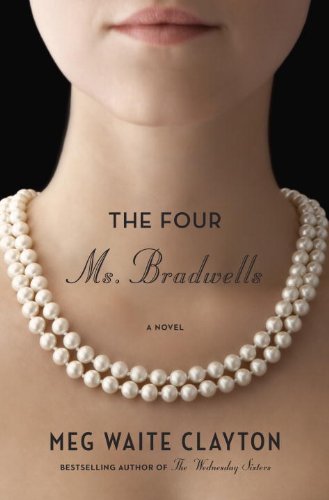
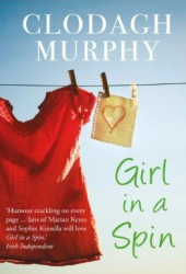
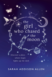
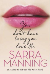
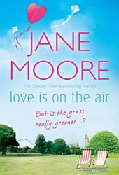
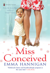
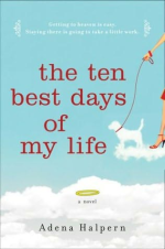
Now, here are some covers I just plain adore:


These are only some of the covers I adore - there are tons more. I love all of Paige Toon’s covers, I think Simon & Schuster have some of the best artwork designers on their team and they always do a fab job. Penguin have finally given Marian Keyes a decent book cover. I hate the gold hardback cover for The Brightest Star in the Sky so I’m so pleased they re-designed it for the large paperback release. As for I Remember You, it’s just gorgeous! Pieces of my Heart is really eye-catching and the purple and gold go really well together. What I like about The Debutante is the simpleness of the whole cover. It’s not trying too hard and it’s just really cute.
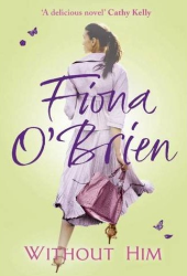
Now for some I don’t particularly like…


I have to admit that I’m really not a fan of Jane Green’s covers. They just seem all over the place to me. I was pleased to see that her next book has been re-designed and now looks much better! I really enjoyed Lucy Springer Gets Even but I absolutely hated the cover. It really is one of the worst I’ve seen - even Lisa herself doesn’t really like it. As for Bad Money, I never would have picked this book up except for being sent it to review, as I was. It’s really bad, and the publishers know that, as it’s been re-designed for it’s paperback release. When Chloe posted her review of A Good Girl Comes Undone I was shocked at the cover. The gold cover looks really really terrible, it’s not a background colour that should be used on a book cover, no matter how striking it may be! As for the final cover - Rosy Thornton’s upcoming book - it just looks drab and rather dull, which is unfortunate as all of her other book covers look really nice.
So, as far as I can tell, there isn’t really a specific thing that makes a book cover good, it’s more getting everything right - the fonts, the colours and, most importantly, the pictures/graphics. And, of course, just because I saw I like/don’t like a cover doesn’t mean everyone’s going to like/dislike it. Personal preference obviously plays a huge part in whether a cover is actually good or not but after being asked by an author my thoughts on covers, I decided to have a look at numerous covers and pick out some to compare and ones I like and don’t like. I hope you’ve enjoyed the post & do tell us your favourite/least favourite book covers!


