A brand new feature on Chicklitreviews.com is Cover Stories! We have noticed that book covers are a huge part of a books appeal whether we like to admit it or not, and the age old adage “don’t judge a book by it’s cover” is less relevant now than it has ever been! Therefore, we’ve taken it upon ourselves for this new feature to quiz a whole lot of chick lit authors, some who have been around the genre for a good few years, some debut authors, about the importance of their book covers, and what they mean to them. We hope you like the feature!
This week I have been speaking to chick lit author Lindsey Kelk about her book covers. Lindsey has written the ‘I Heart…’ series, and already has the experience of 3 books cover, as well as their very different international covers too. Take it away, Lindsey!
 “Before I started writing, I worked in children’s licensed publishing, which meant I spent five years writing and developing tie-in programmes for lots of different brands. A big part of that was working with the art team to create covers that got our message across as easily and as clearly as possible. Sitting in that cover art meeting, holding up three different versions of a Shrek the Third sticker book teaches you a lot more than you’d think… ’green covers don’t sell’ ‘Why isn’t Shrek making eye contact with me?’ ‘I can’t read the tagline’ ‘It’s not obvious enough that there are stickers inside’ etc .etc. I saw covers as a marketing tool, they sells the insides for you.
So when it came to Cover O’Clock for I Heart New York, I was fascinated. I tried to be a good author (I think) and took a total backseat while the amazing art director did her job on the very  first UK cover. It was weird, I’d never really been involved with this kind of book before and given that I wasn’t a very ‘pink person’ I think my editor had concerns that I would hate their ideas. But despite my position as chick lit’s leading WWE expert, I loved it. The cover said everything it needed to – it promised a bright, breezy read and I really felt like it put you in Angela’s shoes from the outset, looking up at the Chrysler building, lost for words as the yellow cabs swept by. It made me want to hold my breath.
And so, when the second I Heart New York cover came in from HarperCollins Canada, I was a little surprised. The cool tones of the UK cover had been warmed up to shades of pink, overlaid with a sophisticated silhouette motif. And suddenly, it was ‘a novel’. So far, so Sex and the City. But they loved it and it worked.
 A year later, HarperCollins US got in on the action. Lots of people had sat me down and explained that chick lit didn’t do so well in the US, so I shouldn’t put too much expectation on it. So I was expecting that. What I wasn’t expecting was the super hipster photographic cover that the US came up with. It was almost a photo-real version of the original illustrated cover. Nothing quite so fluffy and comforting as the UK version, or Sex and the City-alike graphic approach of the Canadian version. The US edition seems more modern, more cinematic even. It’s something you could read on the subway without scorn. And New York loves a bit of scorn. They’re less keen on pastels. Which is sort of sad.
Weirdly, despite the three cultures being relatively similar, each of these very different covers seem to be doing well in their respective territories. My New York friends wouldn’t be caught dead with the bright pink Canadian cover, I’ve heard my Canadian buddies call the UK version ‘patronising’ and my UK readers love their fresh, fun covers that tell you exactly  what the book is about. God forbid what would happen if they saw the Serbian efforts. They are… interesting.
A loyal lover, I will always stay faithful to my UK covers (I Heart Paris is my favourite) but I find it fascinating that different marketing teams, editors and art departments saw these three very different stories within one book. No matter what cover goes on the outside, it’s still the same book, about fantasy and escape and taking a chance. Apparently some countries think that’s a pinker idea than others.”
Thank you Lindsey!

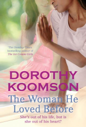
 Serena Doyle lives a content life. She has a wonderful husband, Paul, she lives the life she’s always dreamed of, and she is the epitome of sophistication and glamour. But Serena has a dark secret, and when she realises just how much she wants a baby, she’s going to have to confront that secret once and for all. Ruby White is just sixteen when she finds out she’s pregnant. Her parents hit the roof and refuse to listen to her, telling her they’ll raise the baby themselves, but her parents forget to ask what Ruby wants.