

Cover Wars: Promises, Promises by Erica James
Posted By Chloe on April 21st, 2011

 Now this is an interesting cover wars for me. When Erica James’ book ‘Promises, Promises’ was released last November, I commented in my review that it seemed the publishers had only chosen the winter-y and festive looking cover to sell the book over the festive season. It would now seem I’ve been proved right with the release of the new cover (left) which is certainly more neutral and for me fits in with the essence of the book much more than the slightly mis-leading former cover (right). Which do you prefer? And do you think its right for publishers to create covers that suit the time of year rather than the story inside the book?
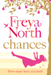
Similar Posts
Share
- Digg
- Stumble it!
- Cover Wars: Mini Shopaholic
- AW Cover Wars: What Alice Forgot by Liane Moriarty
- Cover Wars: The Love Verb by Jane Green
Posted in Cover Wars
Comments 5


April 21st, 2011 at 12:04 pm
I don’t like either. The crystal/snow ball of the hardback and the hand is totally out of place. It looks horrible and the new cover is just too dark. Neither are particularly outstanding, and the only thing I like is the font of the new paperback for Promises, Promises.
April 21st, 2011 at 1:04 pm
I’m with Leah, I don’t like either, I think some color in both covers wouldn’t of gone a miss, I don’t think publishers should target book covers to mix in with the time of the year, because people may well walk past it cos the cover is boring!
April 21st, 2011 at 4:09 pm
I really don’t like how publishers change a cover to match the season of the book release. If it doesn’t match the story, it’s bothersome. If the cover matches the story and not the season, I am more likely to pick it up because it’ll be something different from all the other books around it.
April 21st, 2011 at 6:37 pm
I think I prefer the silhouettes.
April 21st, 2011 at 8:15 pm
I prefer the silhouettes however the background colour is still very drab - compare it to her book Airs and Graces very colourful, picturesque and light hearted and the book was amazing also!