
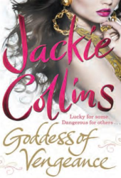
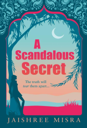
Do Judge A Book By Its Cover: The Real Katie Lavender

Colours & Fonts: ![]()
Graphics/Pictures used: ![]()
Overall design: ![]()
Why we like/dislike it: I hate to say it, but this could just be one of the worst book covers I have ever seen. It is so uninspiring it’s untrue. The picture is generic, naff and boring, the text looks a bit cheap even though the lavender colour does tie in nicely. The off-white background also looks so unbelievably dull. It seems like they did this cover on the cheap, with as little effort going into it as possible. I’ve shown this to two other people who also agree with me they wouldn’t look twice at this book with its cover. I can’t understand or fathom why the publishers would choose to put this image on a book cover, it’s simply dire.
Overall mark out of 10: ![]()
Would we buy this book based on its cover? NO!
Do Judge A Book By Its Cover is a new feature on Chick Lit Reviews, where we take a look at some of the best (and worst) Chick Lit covers in existence. No synopsis, no hint of the story, just plain old book cover judging, with marks out of 10!
- Digg
- Stumble it!
- AW Giveaway: What Came First by Carol Snow
- AW Book News: The Bird Sisters by Rebecca Rasmussen
- AW Book Review: Past Perfect by Leila Sales


August 30th, 2011 at 3:31 pm
I thought the crystal ball cover for Promises, Promises was horrible… but this is just wow. There are no words. How can they re-design Erica’s other books with lovely covers and give her THIS for her most recent book? I prefer the one they had up originally for it because this just isn’t anything. It’s a title, an author name and two champagne glasses. It’s terribly dated. I wouldn’t even glance at it in a shop.
August 30th, 2011 at 4:18 pm
LOL! It definitely lacks imagination and looks like something a 10-year-old would come up with. But I’ve seen worse.
August 30th, 2011 at 4:45 pm
I agree…definitely no originality at all!!
♥ Melissa @ Melissa’s Eclectic Bookshelf</a
August 30th, 2011 at 5:09 pm
WHAT!!! What happenend to this gorgeous cover: http://chicklitreviews.com/wp-content/uploads/2011/08/erica-james-the-real-katie-lavender.png ?!?!
I loved it!
OK, I don’t particularly hate the cover above, but the ‘old’ cover was SO much better and more intriguing. This one’s boring, just the stars are kinda cute, but otherwise blah.
What on earth is going on with the publishers this year?!?!?! It’s like one horrible cover re-design after another … What the hell are they all smoking? This is making me SO saaaad. Why are they destroying lovely chick lit covers on purpose? But whatever, I just won’t buy them then.
September 4th, 2011 at 7:47 pm
I thought the cover was too busy with all the stars (or spots or whatever they are) in the background. The font blends in too well with the background as well, so much that it fades all togther.