
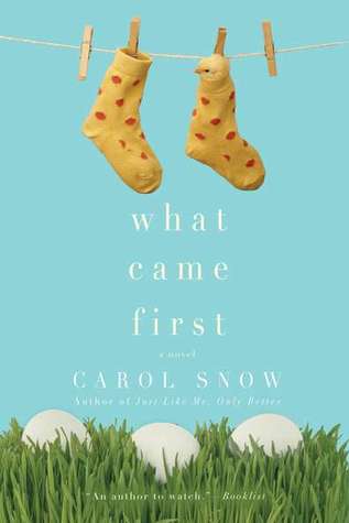
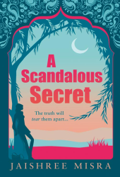
Do Judge A Book By Its Cover: Too Close For Comfort
Colours & Fonts: ![]()
Graphics/Pictures Used:
Overall design: ![]()
Why we like/dislike it: This is a bit of a strange one. Whilst I like the use of a bright background colours, and the swirly font for the book title, there is just nothing special about this cover at all. It doesn’t really tell you anything about the book itself, it doesn’t have a specific author look to it, and it might be one that I simply glance past on a bookshelf as it wouldn’t stand out to me at all. It’s nice enough but it just seems a bit too generic for me unfortunately!
Overall Mark out of 10: ![]()
Would we buy this book based on the cover? Probably.
Do Judge A Book By Its Cover is a new feature on Chick Lit Reviews, where we take a look at some of the best (and worst) Chick Lit covers in existence. No synopsis, no hint of the story, just plain old book cover judging, with marks out of 10!
- Digg
- Stumble it!
- Book Review: 4am in Las Vegas by Michelle Jackson
- Book Review: The Best of Me by Nicholas Sparks
- Giveaway: Win a copy of The Best of Me by Nicholas Sparks plus a book plate!


August 2nd, 2011 at 3:44 pm
This was released in ireland with the usual style cover from this author (bright colour wit border detail)
I wasn’t fussed on orignal cover but miles better than this version.
Agree not loving this look it a bit too basic!
August 2nd, 2011 at 4:02 pm
Nope. I agree with what you said - too generic. Nothing stands out. Even the colors are dull.
August 2nd, 2011 at 4:13 pm
No. It’s too smaltzy. Plain really. It would stand no chance against some of the great covers it will have to compete with. Sad factfor her,a good cover does attract buyers.
August 2nd, 2011 at 8:52 pm
It’s not a spectacular cover, but I think I would, actually.
August 2nd, 2011 at 10:43 pm
Love it!