
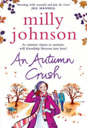
Do Judge A Book By Its Cover: Pear Shaped

Graphics/Pictures used:
Overall design:
Why we like/dislike it: I’ve been looking forward to this book for a while now so imagine my disappointment when I saw the cover for the book… awful! I can’t stand white backgrounds for book covers, they look really bland, but combine it with the bright red and magenta pink, well I just feel it looks dated and awful. I can’t say too much for the graphic either, it doesn’t seem to tell us anything about the book and looks like a bit of clip art stuck on the side. Also, the author’s name at the top is far too small and in light green(?!) which doesn’t fit in with the rest of theme and just looks a bit silly. Such a bad cover, and I certainly don’t think I’d look twice at this cover. What a pity!
Overall mark out of 10: ![]()
Would we buy this book based on its cover? No.
Do Judge A Book By Its Cover is a new feature on Chick Lit Reviews, where we take a look at some of the best (and worst) Chick Lit covers in existence. No synopsis, no hint of the story, just plain old book cover judging, with marks out of 10!
- Digg
- Stumble it!
- AW Do Judge A Book By Its Cover: P.O. Box Love by Paola Calvetti
- Do Judge A Book By Its Cover: Looking For Leon
- Do Judge A Book By Its Cover: The Secret of Happy Ever After


September 13th, 2011 at 6:16 pm
Blah. And where is the pear shaped girl?
September 13th, 2011 at 7:56 pm
Their are some books i want to hold in my hands and some that i dont mind being on kindle and this is always based on cover design…..this is for sure a kindle book!
September 18th, 2011 at 12:52 pm
When are publishers going to stop depicting all women on covers like cartoon fifties housewives? We are in the twenty-first century now.
September 18th, 2011 at 4:08 pm
It’s more like: Cocktail Waitress. Not keen on the pink, girly, look. Cannot decipher the theme from that cover.