
Do Judge A Book By Its Cover: Goddess of Vengeance

Colours & Fonts: ![]()
Graphics/Pictures used: ![]()
Overall Design: ![]()
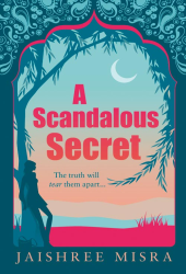
Why we like/dislike it: Last year (or the year before), I was hugely impressed with the new modern look Jackie Collins’s publisher had given her. Poor Little Bitch Girl’s cover appealed to me, it was fresh, funky, modern and it undoubtedly attracted many (younger) Chick Lit fans to pick the book up. So I must admit, the cover for Goddess of Vengeance seems to have taken a massive step back. There’s nothing inspiring about the cover that would make me, at 21, pick up my first Jackie Collins novel. There’s nothing to it. No colour, very drab, just plain boring. The only saving grace that I can see is that it matches my mother’s older Jackie Collins books. But that’s not really enough. I’d glance straight over this cover, it wouldn’t catch my attention at all. If I was going to buy this book, I’d buy the American cover which has brought Jackie’s books bang up to date. This one, however, is stuck in a time warp. Which is unfortunate. The only people who will probably buy this, will be die hard Jackie fans, I don’t personally think the casual Chick Lit fan would pick this one up with so many other stunning books out there.
Overall mark out of 10: ![]()
Would we buy this book based on its cover? No.
Do Judge A Book By Its Cover is a new feature on Chick Lit Reviews, where we take a look at some of the best (and worst) Chick Lit covers in existence. No synopsis, no hint of the story, just plain old book cover judging, with marks out of 10!
- Digg
- Stumble it!
- AW Do Judge A Book By Its Cover: P.O. Box Love by Paola Calvetti
- Do Judge A Book By Its Cover: Looking For Leon
- Do Judge A Book By Its Cover: The Secret of Happy Ever After


May 10th, 2011 at 4:24 pm
No! It’s awful!
May 10th, 2011 at 4:46 pm
You know my thoughts already - HEEEELLZ NO!
May 10th, 2011 at 6:48 pm
I actually quite like it. It’s very clean and fresh. Nice and simple. Not everything needs glitter and swirls, you know. Still, I accept it has a quiet, not a flashy appeal. Perhaps they will change it before it comes out anyway.
May 15th, 2011 at 1:06 pm
Bland, uninteresting and not very eye-catching…. sorry!